Safflower
A SAFFLOWER MYSTERY
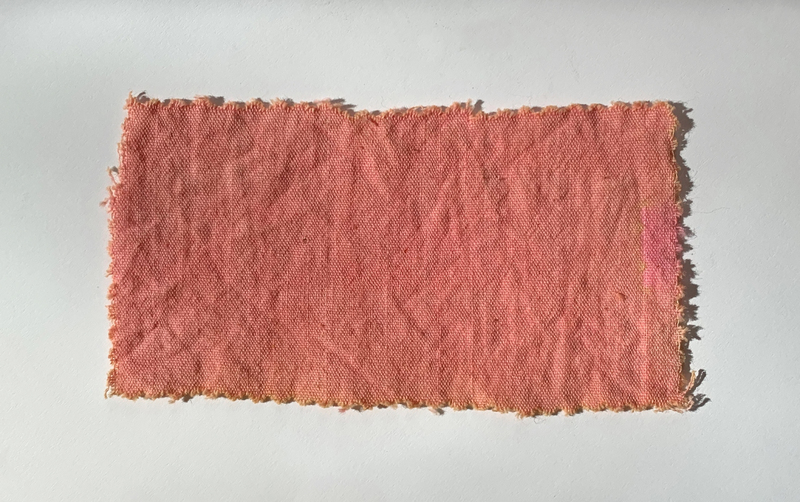
In the Palmer Museum’s print by Hiroshige, the safflower-dyed shibori appears as a muted red. When the Center for Virtual/Material Studies team produced red dye from safflower petals to accompany this print, however, our cotton came out a gorgeous pink. We aren’t sure how to account for the differences, but here are some theories.
1) Maybe the chemistry of our dye bath was off.
2) Maybe we should have dipped our fabric into the dyebath more.
3) Maybe the pigment on the Palmer’s print has faded or changed.
4) Maybe Hiroshige used red ink and assumed that the viewer would understand it to represent safflower pink, since that hue was difficult to achieve with printing inks in the mid 19th-century.
5) Maybe Hiroshige liked the red/blue combination more than pink/blue, and that was more important to him than color matching.
These are just some of the issues that historians must consider when dealing with representations and recreations of color from the past.
— Written by Sarah K. Rich (Art History, Center for Virtual/Material Studies)