Contrasting Colors

CONTRASTING COLORS
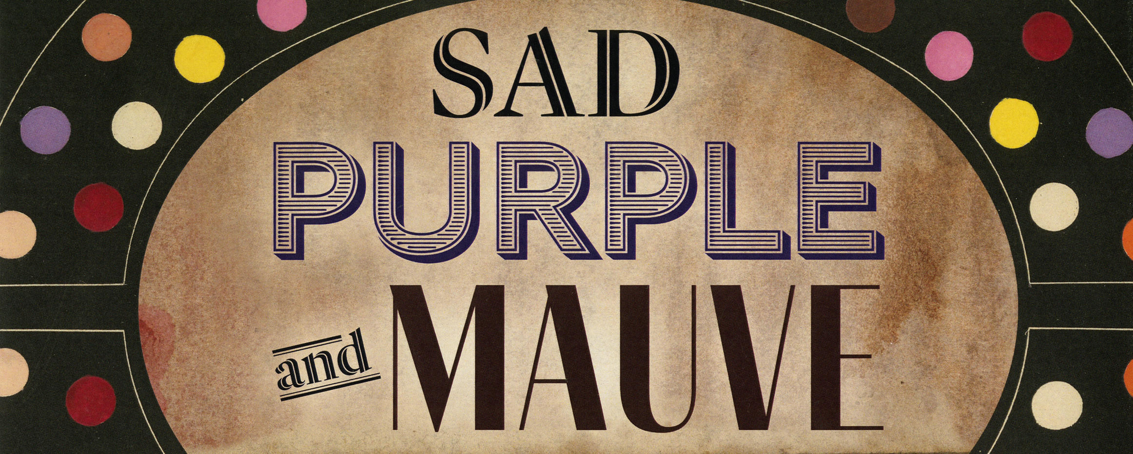
Through the juxtaposition of hand-painted dots on white, grey, and black backgrounds, Michel-Eugène Chevreul’s De la Loi du Contraste Simultané des Couleurs (The Principles of Harmony and Contrast of Colors) demonstrates how perception affects the intensity of colors through the process of "simultaneous contrasts." Chevreul, a chemist and director of Gobelins' dyeing department the famed producers of dyed textiles for French royalty dating back to the 15th-century (see Diderot’s Encyclopedia on view in the largest case near the guest book for more information) illustrated how juxtaposing contrasting colors strengthens their luminosity. Inversely, juxtaposing two similar colors weakens their intensity. This effect can be observed on the displayed page: the purple dots on the black background appear to us as a deeper purple than those against a white background due to the stronger contrast.
The idea for "simultaneous contrasts" originated from an issue with the dyes used at Gobelins. Employees noticed that the color of the black wool used in their workshop was less intense than those used by other companies. Upon further scrutiny, Chevreul realized that the dye’s dullness was not related to its quality but to how it was juxtaposed with other colors.
— Written by Triana Cancel (Graduate Student, Art History)
Michel-Eugène Chevreul
De la Loi du Contraste Simultané des Couleurs: et de l'Assortiment des Objets Colorés, Considéré d'après cette Loi
Paris: Chez Pitois-Levrault et Ce, 1839
Purchased with funds from the Mary Ann O'Brian Malkin Endowment for Rare Books and Manuscripts, 2020